
Greetings, StoreProp readers! Are you seeking to create a brand identity that’s not only distinctive but also unforgettable? Well, look no further! Color and design play pivotal roles in creating a visual brand identity that can make a lasting impression.
When thinking of how to capture attention, colors and designs are one of the first things people notice. Sometimes even subconsciously, not understanding it immediately.
But for brands it is especially important to realize the effects of color psychology. So in this article let’s delve into the strategic use of color and design elements and their psychological impact on your brand identity.
The power of color in branding
Color is a potent tool in the realm of branding. It’s the visual component people remember most about a brand.
So the first thing to know is that color communicates your brand’s personality. It eventually sets the emotional tone for how consumers perceive your brand.
As each color conveys different meanings and feelings, color psychology is an important factor in developing a brand identity. For example, red is a common color for fast food restaurants such as McDonald’s and KFC because it is associated with passion and excitement.

Tech companies and financial institutions often utilize blue as it is a symbol of reliability and confidence.
On the other hand, the color green usually refers to nature or environmental friendliness and exudes a sense of balance and calm. Thus, it fits well with brands that are sustainable or organic.
Choosing the right palette of colors can greatly raise the visibility and perception of your brand. But keep in mind that consistency is essential. The way consumers think of your brand are strengthened when the paint scheme used for all brand elements—such as the logo, website, packaging, and advertising—is consistent.
Main role of design elements in branding
Design elements are visual metaphors that not only aesthetically but also visually express your brand narrative. So consider that every aspect of design, especially typography and logo shape, says something about your company.
For example, a logo with angular, clean lines may indicate a company that is forward-looking and futuristic. A flowing, curved design can indicate a friendlier, more approachable brand.
The design of a brand identity is also heavily influenced by the typography. Given that serif type is timeless, it can give a company an air of tradition and reliability. Sansserif fonts, on the other hand, are considered modern and simple, making them ideal for start-ups or IT companies.
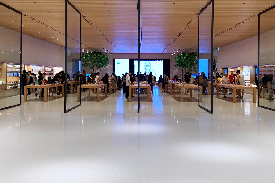
The way space – also known as “white space” – is used in design influences how valuable people perceive your brand. Companies like Apple use enough white space to create a sense of elegance, sophistication and superiority.
Design elements need to blend harmoniously to accurately express your brand’s personality and core values. Keep in mind that design must appeal to your target market and differentiate you from your competitors.
Make design align your brand message
Your color palette and other design elements should support your brand message to create a strong brand identity.
What you want to say to your customers is summed up in your brand message. It is the distinctive value proposition that makes up your brand promise. Your design elements and color palette become a visual reflection of your promise to the customer if they are consistent with that message.
For example, a contemporary style combined with strong, eye-catching colours can support the perception that your company is focused on innovation and forward thinking. Moreover, when we talk about modern, we often think of a simpler, minimalist style.
However, if your business is all about exclusivity and luxury, a thoughtful layout with a quiet, elegant colour palette can help reinforce these ideas.
Starbucks and Coca-Cola are two great examples of this. Coca-Cola vibrant red communicates joy and nostalgia with a traditional font and a striking red color. The Starbucks symbol and the green color palette are in line with Starbucks’ concept of sustainability and community.

Follow emerging trends in color and design
As we look to the future, new trends in color and design are emerging that can influence your brand identity creation.
- Minimalist design – as we mentioned before, minimalism continues to dominate the design landscape. Brands are adopting simple, uncluttered designs that communicate their message effectively and cater to the consumers’ desire for simplicity and authenticity.
- Bold, saturated colors – as brands strive to stand out in a crowded market, the use of bold, saturated colors is on the rise. These colors draw attention and are excellent for creating a dynamic, energetic brand image.
- Flexible branding – with the advent of digital media, brands are increasingly adopting flexible branding strategies, where the logo or design adapts to different contexts while still maintaining consistency and recognizability.
Establish a great brand identity
In conclusion, we must admit that a strategic blend of color and design can help establish a great brand identity. One that resonates with your target audience, stands out in the marketplace, and leaves a lasting impression.
Check out our other related articles such as:
Make sure to always remember that your brand identity is more than just a visual element. It’s also the face of your brand that communicates your brand’s values, personality, and promise to your customers.
So stay tuned with StoreProp for more insights, trends, and tips on effective retail management, marketing, and merchandising.